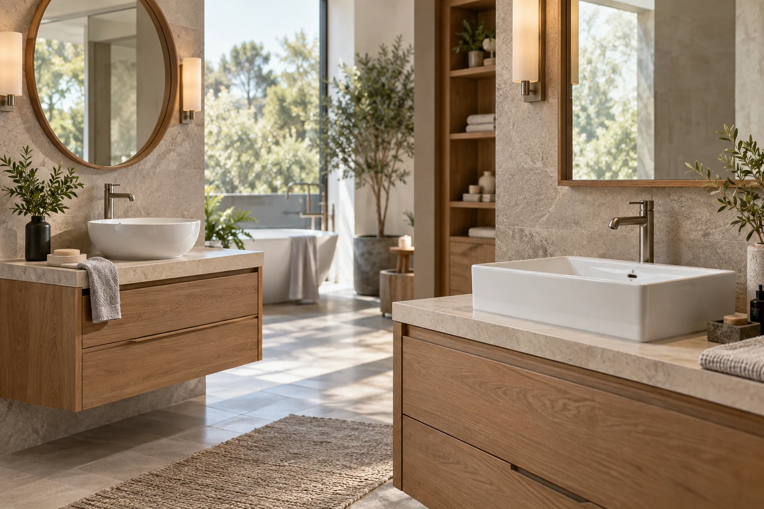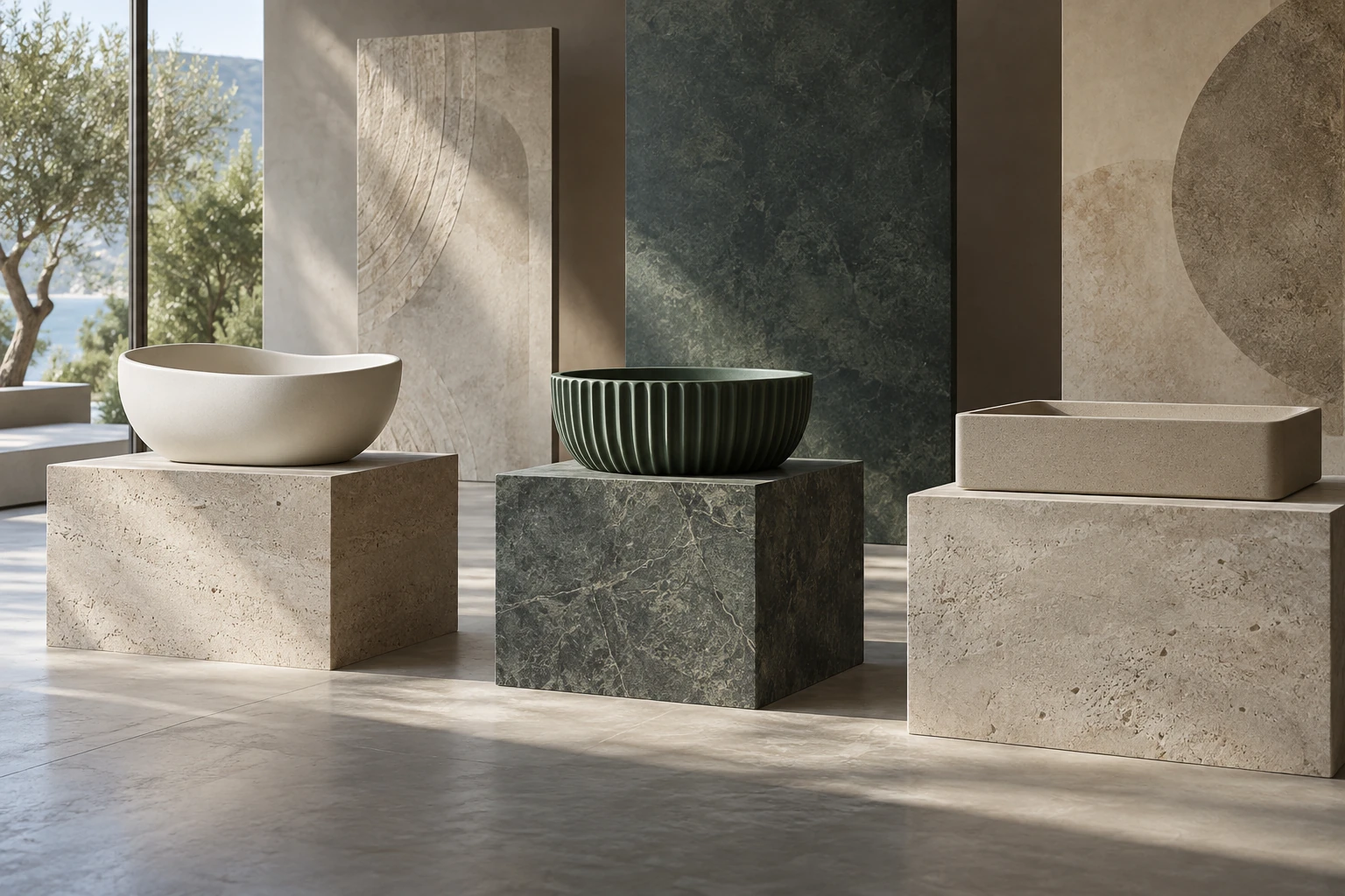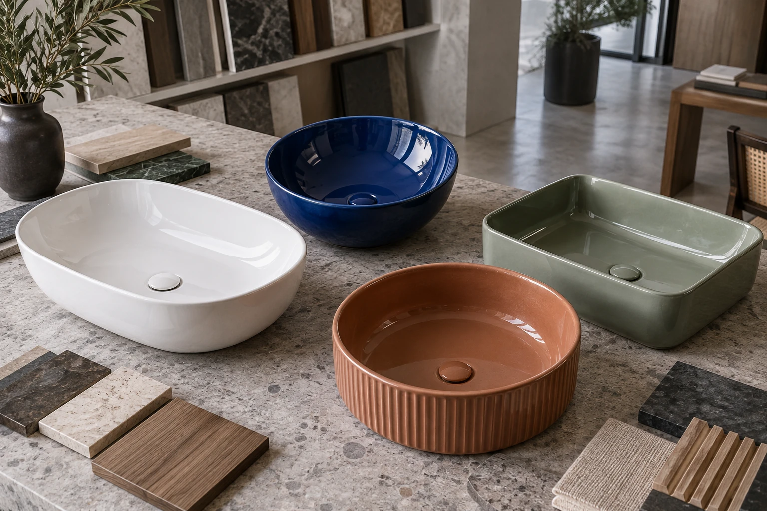
Color decisions in ceramic sinks are often discussed as a trend question, but for a commercial buyer they are also a stock, display and quality-control question. White basins can move across many bathroom styles. Colored basins create a stronger point of view, which can be valuable when the market is clear and expensive when it is not.
Why white ceramic sinks remain the core
White works with a broad selection of taps, tiles, countertops and sanitary ware. It is familiar to installers and easy for customers to imagine in their own bathrooms. For distributors, that flexibility can support steadier demand and simpler replacement conversations.
White is not one completely uniform visual category. Glaze tone, gloss, surface reflection and surrounding light affect perception. If a sink must coordinate closely with another ceramic product, compare physical samples under the intended lighting rather than assuming every “white” will read identically.
What colored basins add to a range
Color can give a bathroom brand a recognizable collection, help a retailer create an arresting display or allow a project designer to repeat an accent across rooms. Deep green, blue, warm earth tones, grey and black each place the basin in a more specific design context.
That specificity is the strength and the risk. A color that performs well in a design-led showroom may move slowly in a price-sensitive distribution channel. The first question should be where the product will be seen and who is expected to choose it.
Match color depth to the sales channel
A broad wholesaler may prefer a compact color offer around proven shapes. A bathroom brand can carry a more coordinated palette if it also controls furniture, mirrors or taps. Online sellers need photography that represents the finish responsibly, while physical retailers can use lighting and material boards to show how it behaves.
Project buyers should consider replacement and phased supply. A distinctive finish can be successful, but the approval sample and model record become more important when rooms are delivered across multiple phases.
Build a palette, not a pile of colors
Start with the shapes that already suit the market. Then apply color selectively. Repeating five colors across ten shapes creates fifty variations before size is considered, which can make sampling, forecasting and stock control difficult.
A disciplined range might pair white with one dark neutral and one character color, then expand only when there is evidence of demand. Consider how the basin looks with locally common countertop materials and cabinet finishes. The most appealing isolated color is not always the easiest to merchandise as a bathroom set.
Use a physical finish approval process
Screens change color, and photographs change it again through lighting and editing. Keep a signed or otherwise identified sample when color matters. Review it under neutral light and under a warmer environment similar to the showroom or project. The ceramic glaze inspection guide explains how to control viewing zones and lighting.
Define the surface as well as the hue. Glossy glaze has bright reflections and often feels more familiar. Matte finishes create a softer effect but show handling and water marks differently. Metallic decoration changes with viewing angle and needs separate care in packing and display.
Plan labeling, packing and after-sales records
Color names can be subjective. Use the supplier’s exact model and finish code in orders, carton labels and internal systems. Do not depend on names such as “forest,” “sage” or “charcoal” without a linked reference. When multiple finishes share the same basin shape, clear carton identification prevents warehouse mistakes.
Protect decorative surfaces from rubbing. Store samples and stock in a way that avoids dust, metal contact and adhesive marks. For customer service, keep the product photograph, code and approval reference together.
A practical way to balance white and color
Build the core around shapes and sizes that solve real installation needs. Use white where flexibility and turnover are priorities. Add selected color where the customer, display and surrounding materials support it. The article on ceramic bathroom sink trends for project buyers shows how color can be specified without losing project discipline.
The choice is rarely white or color. Strong ranges use both with different jobs: white provides continuity, while color creates focus. The commercial result depends on knowing which job each product is expected to do.